Hello everyone, back again at porkaone. On this occasion we will learn to make various kinds of graphs easily in the Excel application. Come on, follow the full article below.
Data presented in tabular form will be easier to read and understand if it is presented in the form of graphs or diagrams. By using graphs or diagrams, long lists of data can be summarized so that it is easier for the viewer to understand the entire list of data.
There are several examples of graphs or diagrams that we usually use to create reports, namely line charts, pie charts, and bar charts. We will learn about the three diagrams how to make them in the Ms. Excel.
How to Create a Bar Chart (Bar Chart)
Bar chart or bar chart is a chart that is often used for data comparison. For example, comparing gender data, population data in several areas and other examples of data that can be compared. Data is usually presented in the form of bars with a vertical or horizontal model. In Excel, a bar chart with a vertical model is called a column chart, while a bar chart with a horizontal model is called a bar chart.
1. To create a bar chart in Ms. Excel, first prepare a list of data as shown below. The following is an example of the distribution of population data in various countries in the world.

|
|
Make Bar Chart (1) |
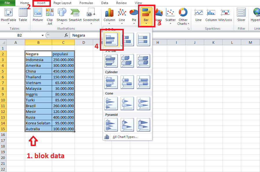
2. Please block the entire column. Then select the insert menu → click bar → click an example diagram. Follow the image below for details.
|
| Make Bar Chart (2) |
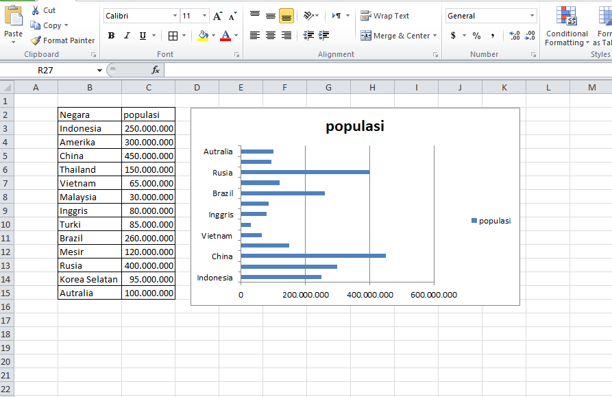
Then the result will look like the image below. Below is an image of a bar chart, on the left there is a country label, then the population of each country is represented by bars (bars). And at the very bottom is the estimated population.
|
|
Make Bar Chart (3) |
How to Create a Line Chart (Line Chart)
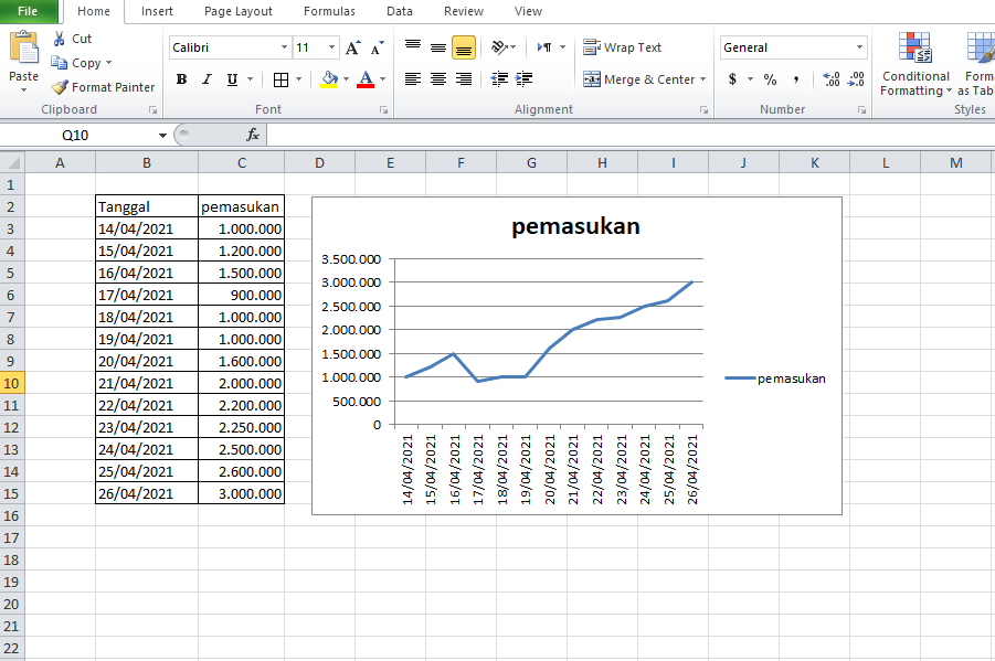
Line chart or line chart. This diagram is commonly used to monitor an entity from time to time. For example, the development of product sales from month to month, or income, or the frequency of internet network speed, etc. This diagram is depicted in the form of a transverse or longitudinal line. If there is an increase then the line will also go up, and if there is a decrease then the line will also go down.
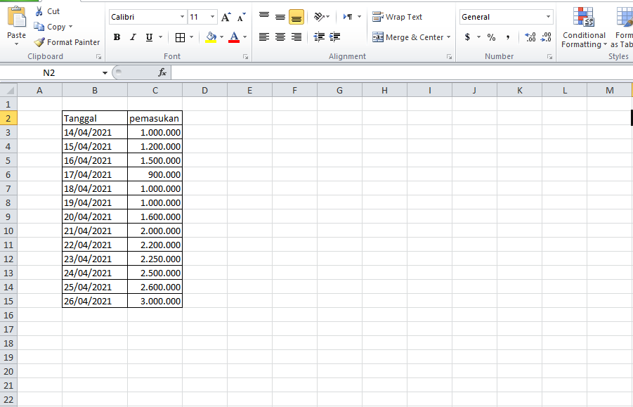
1. To make a line chart, first of all, please prepare sample data as shown below. The image below is an example of earnings for a few days in April 2021.
|
|
Make Line Chart |
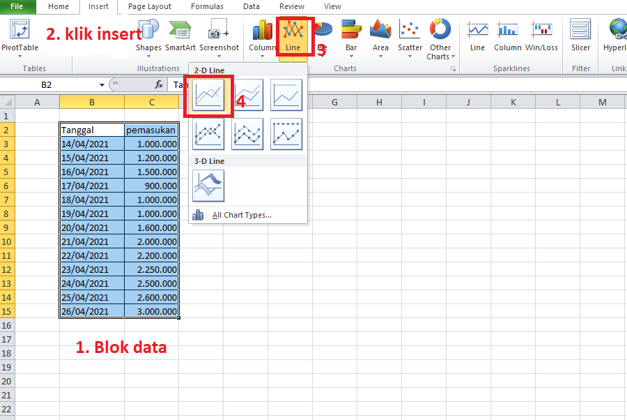
2. Next block all columns, click the insert menu → select line → then click an example diagram. Please follow the image below for more details.
|
|
Make Line Chart (2) |
The result will look like the image below. On the left side is the number of entries, then at the bottom is the date. Data entry from time to time is described in the form of a diagram.
|
|
Make Line Chart (3) |
How to Create a Pie Chart (Pie Chart)
Pie chart or pie chart. This diagram is usually used to describe the distribution or distribution of data according to each existing entity until the value reaches 100%. We can use this chart to compare the number of genders, the number of populations, etc.
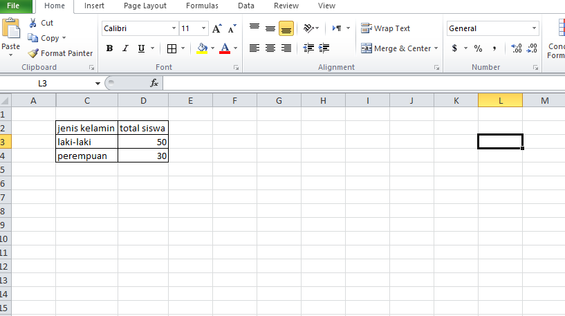
1. To make a pie chart, first of all please prepare a list of data as shown below. The following is the number of students in a school by gender.
|
| Pie Chart (1) |
2. Then block the entire column, select the insert menu → select pie, and select one of the existing chart types. Follow the following image for more details.

|
| Pie Chart (2) |
The result will look like the image below. A circle diagram. male data is colored blue and female data is colored red.

|
| Pie Chart |
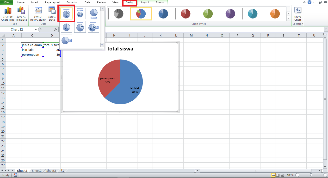
If you find it difficult to see the presentation of the pie chart example above, you can change the style of the diagram to make it easier to read. To do this, please click the diagram image → click the design menu → then select one of the existing layouts.
|
| Change Chart Style |
A few tutorials on how to make various kinds of graphs and diagrams in the Excel application. Hopefully this short article is useful. If there are difficulties, please ask directly in the comments column below. See you in another interesting tutorial


0 Comments
Come on ask us and let's discuss together
Emoji